Buttons
Operator Buttons
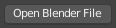
Operator button.
Operator buttons perform an action when clicked with LMB. Button may show an icon, text, or both.
Checkboxes & Toggle Buttons
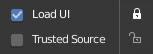
Checkboxes and Toggle buttons.
These controls are used to activate or deactivate options. Use LMB to change their state. A tick is shown on checkboxes when the option is activated. Active status on toggle buttons is indicated either by color on the icon background, or a change in icon graphics.
Dragging
To change many values at once on or off, you can press down LMB and drag over multiple buttons. This works for checkboxes, toggles and to select a radio button value.
Radio Buttons

Radio buttons.
Radio buttons are used to choose one option from a selection of options. Active button is indicated by a color on the icon background.
Cycling
Use Ctrl-Wheel, while hovering with the mouse over radio buttons, to cycle between the options.
Direction Buttons

Direction buttons.
Clicking with LMB in the sphere and dragging the mouse cursor lets the user change the direction by rotating the sphere.
Shortcuts
LMB (drag) rotates the direction.
Ctrl (while dragging) snaps to vertical & diagonal directions.