Tabs & Panels
Tabs

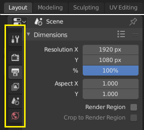
Top: Horizontal Tab header in the Topbar. Bottom: Vertical Tab header shows tab icons in the Properties.
Tabs are used to control overlapping sections in the user interface. The content of only one Tab is visible at a time. Tabs are listed in a Tab header, which can be horizontal or vertical.
Switching/Cycling
Vertical tabs can be switched with Ctrl-Wheel from anywhere in the tab. You can also cycle through tabs with Ctrl-Tab and Shift-Ctrl-Tab, or press down LMB and move the mouse over the tab header icons. (This does not apply to Workspace tabs; see Workspace controls.)
Panels

Panels in Properties.
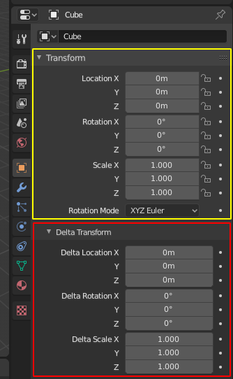
A panel is highlighted in yellow and a subpanel in red.
The smallest organizational unit in the user interface is a panel. The panel header shows the title of the panel. It is always visible. Some panels also include subpanels.
Collapsing and Expanding
A panel can either be expanded to show its contents, or collapsed to hide its contents. An expanded panel is indicated by a down-arrow (▼) in the panel header, while a collapsed panel is shown with a right-arrow (►).
Clicking LMB on the panel header expands or collapses it.
Pressing A expands/collapses the panel under the mouse pointer.
Clicking Ctrl-LMB on the header of a collapsed panel will expand it and collapse all others.
Clicking Ctrl-LMB on the header of an expanded panel will expand/collapse all its subpanels.
Dragging with LMB over the headers will expand or collapse many at once.
Position
You can change the position of a panel within its region by clicking and dragging the grip widget (::::) on the right side of its header.
Pinning
Sometimes it is desirable to view panels from different tabs at the same time. Like, for instance, having access to a camera's properties, while other objects are selected. This has been solved by making panels pinnable.
A pinned panel remains visible regardless of which tab has been selected. You can pin a panel by clicking on the pin icon in its header. Panels that do not have a pin icon can be pinned by RMB on the panel header and selecting Pin, or by pressing Shift-LMB.
ملاحظة
Pinning is not available for all panels. For example, it's available in the Sidebar but not in the Properties editor.
Presets

Example Presets menu.
- Selector
A list of available presets. A selection will override the included properties.
- Add
+ New presets can be added based on the currently applied set of properties, which will be saved for later reuse. A pop-up opens where you can set a name, after which you can select it from the list and in some cases additional settings.
- Remove
- Deletes the selected preset.