Node Groups
Example of a node group.
Grouping nodes can simplify a node tree by hiding complexity and reusing common functionality. A node group is visually identified by its green title bar.
Conceptually, node groups allow you to treat a set of nodes as a single unit. They are similar to functions in programming: reusable, composable, and parameterizable.
For example, suppose you create a “Wood” material and want to use it in multiple colors. You could duplicate the entire node setup for each color, but maintaining those duplicates would be tedious if you later decide to change the wood grain detail. Instead, you can move the nodes that generate the wood pattern into a node group. Each material can then reuse this group and supply a custom color as input. Any updates to the grain detail need to be made only once—inside the node group.
Node groups can be nested; that is, a group can contain other groups.
Note
Recursive node groups are prohibited to avoid infinite recursion. A group cannot contain itself, directly or indirectly.
Tip
Like other data-blocks, node groups with names that start with . are hidden
from menus and lists and can only be accessed via search.
This is useful for node asset authors who want to hide internal utility groups from end users.
Group Input and Group Output nodes are used to represent data flowing into and out of the group.
The Group Input node provides access to the group’s input sockets from within the node group. These sockets act as parameters that control the behavior of the group from the outside. You can connect them to internal nodes to drive values such as factors, colors, or geometry inputs.
Note
Input values that do not affect the output will be greyed out.
The Group Output node defines the data that is passed out of the node group. Only sockets connected to this node will be available as outputs on the group itself.
Important
Avoid using nodes output nodes such as Material Output or Composite inside node groups. These should be used on the top level node tree to improve re-usability of node groups.
Use Group Output to pass data out of a node group.
Usage
Managing Inputs/Outputs
You can add, remove, and reorder input and output sockets in the Group panel in the Sidebar. New sockets can also be created directly by dragging a link to or from the hollow socket on the Group Input or Group Output node to another socket in the node editor.
Reusing Node Groups
Reference
- Menu:
- Shortcut:
Shift-A
Existing node groups can be placed again after they’re initially defined, be it in the same node tree or a different one. It’s also possible to import node groups from a different blend-file using .
Tip
When appending node groups from another blend-file, Blender does not distinguish between types such as material or compositing groups. To avoid confusion, it is recommended to adopt a naming convention, like using prefixes (Mat_, Comp_, Geo_, etc.), to indicate the group’s context.
Properties
Group
Reference
- Panel:

The Group panel.
This panel contains properties that relate the group node such as it’s name and look.
- Name
The name of node as displayed in the Title.
- Description
The message displayed when hovering over the Title or in add menus.
- Color Tag
Color tag of the node group which influences the header color.
- Node Width
The width for newly created group nodes.
- (Set Default Node Width)
Set the width based on the parent group node in the current context
Usage Geometry Nodes
This panel is only visible in the Geometry Node Editor.
- Modifier
The node group is intended for use with the Geometry Nodes Modifier.
- Tool
The node group is intended to be used as a tool.
The data-block menu in the header of the Geometry Node Editor only lists the node groups whose Usage matches the current Geometry Nodes Type.
Tip
If you accidentally disable both Usages, the node group will not be accessible through the data-block menu anymore. To make it accessible again, you can add it as a node to a different node group (), select that node, and press Tab to enter it. From there, you can enable one of the Usages again.
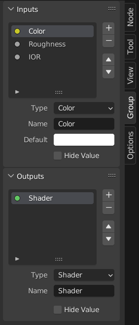
Group Sockets
Reference
- Panel:

The Group Sockets panel.
This panel is used to add, remove, reorder, and edit the user interface elements of a node group. It defines how sockets appear on the group node and organizes them for clarity and usability.
Available item types include:
Inputs: Define input sockets for the node group.
Outputs: Define output sockets for the node group.
- Panels:
Group and organize related sockets together. Useful for structuring complex node setups. Panels always appear at the bottom of the node interface. They can be nested by dragging one panel on top of another in the interface item list.
- Panel Toggle:
Adds a boolean checkbox to a panel’s header, allowing control over its contents. This option is only available when a panel is selected in the interface item list.
Panel toggles have their own options under the Panel Toggle subpanel. Note that toggle sockets are not listed directly in the interface list—panels with toggles instead show a boolean socket icon next to their name. To make the toggle socket visible again, it must be unlinked from the panel.
Note
A panel toggle does not automatically disable or grey out its sockets. To visually and functionally disable sockets, use a Switch Node or similar logic and disconnect the socket manually.
- Interface Item List
A UI list view showing all input/output sockets and panels. Each item can be renamed and configured individually. The name appears in the node’s user interface.
Specials
- Duplicate Item
Duplicates the selected socket or panel.
- Make Panel Toggle
Converts the selected boolean input into a toggle for its parent panel. Only available when a panel is selected and the active item is a boolean socket.
- Unlink Panel Toggle
Removes the toggle relationship between a boolean socket and a panel, making it a regular stand-alone input again.
- Description
The message displayed when hovering over socket properties.
- Default
The value to use when nothing is connected to the socket.
- Min, Max
The minimum and maximum value for the UI button shown in the node interface. Note, this is not a minimum or maximum for the data that can pass through the node. If a socket passes a higher value than the maximum, it will still pass into the node unchanged.
- Dimensions Vector Socket
Sets the number of components for the vector socket: 2, 3, or 4. Changing the dimension affects how the socket is drawn in the interface and how data is passed through the socket.
2D: Shows and uses only X and Y components.
3D: Includes X, Y, and Z components.
4D: Includes X, Y, Z, and W components.
- Closed by Default Panels
Panel is closed by default on new nodes.
Geometry Nodes
- Default Input
Input to use when the socket is unconnected. Requires Hide Value to be enabled.
- Hide Value
Hide the socket value even when the socket is not connected.
- Hide in Modifier
Don’t show the input value in the geometry nodes modifier interface. This allows the input to be used in the context of a node group but not as a modifier input.
This option is only available for geometry nodes and only for input sockets.
- Structure Type
What kind of higher order types are expected to flow through this socket.
- Auto:
Automatically detect a good structure type based on how the socket is used.
- Single:
Only allow single value inputs rather than Fields.
Animation
Controls animation data for node group properties, including active Actions and their assigned Slot.
See Manually Assigning Actions and Slots for more information.
Make Group
Reference
- Menu:
- Shortcut:
Ctrl-G
Creates a new node group that contains all selected nodes.
Group Input and Group Output nodes will be created to represent connections to unselected nodes outside the group. Inputs will be routed to the Group Input and outputs routed to the Group Output.
When grouping a single node, the resulting node group will:
Preserve the interface of the original node, including panels and default values.
Inherit the name of the original node
When grouping multiple nodes, the group is created with inputs and outputs sockets generated from the connections. In this case, a generic name such as “NodeGroup”, “NodeGroup.001”, etc. is used.
Insert Into Group
Reference
- Menu:
Moves the selected nodes into the active group node. To use, select a set of nodes, ending with the destination group node, then, running the operation will move those nodes into that group. The moved nodes are collected into a group of their own to preserve their connection context, having their own group input and output nodes. The group’s existing input and output nodes are updated with new sockets, if any, from the new nodes. The node group must be edited to contain a single Group Input and a single Group Output node.
Edit Group
Reference
- Menu:
- Header:
- Shortcut:
Tab, Ctrl-Tab
With a node group selected, press Tab to move into it and see its content. Press Tab again (or Ctrl-Tab) to leave the group and go back to its parent, which could be the top-level node tree or another node group. You can refer to the breadcrumbs in the top left corner of the node editor to see where you are in the hierarchy.

Example of an expanded node group.
Ungroup
Reference
- Menu:
- Shortcut:
Ctrl-Alt-G
Removes the group and places the individual nodes into your editor workspace. No internal connections are lost, and now you can link internal nodes to other nodes in your workspace.
- Separate P
Separate selected nodes from the node group.
- Copy
Copy to parent node tree, keep group intact.
- Move
Move to parent node tree, remove from group.