Node Groups
Voorbeeld van een node group (nodegroep).
Grouping nodes can simplify a node tree by hiding complexity and reusing common functionality. A node group is visually identified by its green title bar.
Conceptually, node groups allow you to treat a set of nodes as a single unit. They are similar to functions in programming: reusable, composable, and parameterizable.
For example, suppose you create a “Wood” material and want to use it in multiple colors. You could duplicate the entire node setup for each color, but maintaining those duplicates would be tedious if you later decide to change the wood grain detail. Instead, you can move the nodes that generate the wood pattern into a node group. Each material can then reuse this group and supply a custom color as input. Any updates to the grain detail need to be made only once—inside the node group.
Node groups can be nested; that is, a group can contain other groups.
Notitie
Recursive node groups are prohibited to avoid infinite recursion. A group cannot contain itself, directly or indirectly.
Tip
Like other data-blocks, node groups with names that start with . are hidden
from menus and lists and can only be accessed via search.
This is useful for node asset authors who want to hide internal utility groups from end users.
Group Input and Group Output nodes are used to represent data flowing into and out of the group.
The Group Input node provides access to the group’s input sockets from within the node group. These sockets act as parameters that control the behavior of the group from the outside. You can connect them to internal nodes to drive values such as factors, colors, or geometry inputs.
Notitie
Invoerwaarden die de uitvoer niet beïnvloeden, worden grijs weergegeven.
The Group Output node defines the data that is passed out of the node group. Only sockets connected to this node will be available as outputs on the group itself.
Belangrijk
Avoid using nodes output nodes such as Material Output or Composite inside node groups. These should be used on the top level node tree to improve re-usability of node groups.
Use Group Output to pass data out of a node group.
Usage (Gebruik)
Managing Inputs/Outputs
You can add, remove, and reorder input and output sockets in the Group panel in the Sidebar. New sockets can also be created directly by dragging a link to or from the hollow socket on the Group Input or Group Output node to another socket in the node editor.
Herbruik van Node Groups
Reference (Referentie)
- Menu:
- Shortcut (Sneltoets):
Shift-A
Bestaande node groups kunnen opnieuw geplaatst worden nadat ze eenmaal zijn aangemaakt, zowel in dezelfde node tree als in een andere. Het is ook mogelijk om node groups te importeren vanuit een ander blend-bestand via .
Tip
When appending node groups from another blend-file, Blender does not distinguish between types such as material or compositing groups. To avoid confusion, it is recommended to adopt a naming convention, like using prefixes (Mat_, Comp_, Geo_, etc.), to indicate the group’s context.
Properties (Eigenschappen)
Group (Groep)
Reference (Referentie)
- Panel (Paneel):

Het Group paneel.
Dit paneel bevat eigenschappen die betrekking hebben op de group node, zoals de naam en het uiterlijk ervan.
- Name (Naam)
De naam van de node zoals weergegeven in de Titel.
- Description (Omschrijving)
Het bericht dat wordt weergegeven wanneer je met de muis over de Titel zweeft of in add (toevoeg) menu’s.
- Color Tag (Kleurlabel)
Kleurlabel van de node group dat de kleur van de kop beïnvloedt.
- Node Width (Node Breedte)
De breedte voor nieuw aangemaakte group nodes.
- (Standaard Node Breedte instellen)
Stel de breedte in op basis van de parent group node in de huidige context
Gebruik: Geometry Nodes
Dit paneel is alleen zichtbaar in de Geometry Node Editor.
- Modifier
De node group is bedoeld voor gebruik met de Geometry Nodes Modifier.
- Tool (Tool)
De node group is bedoeld om gebruikt te worden als een tool.
Het data-block menu in de header van de Geometry Node Editor toont alleen de node groups waarvan het gebruik overeenkomt met het huidige Geometry Nodes Type.
Tip
Als je per ongeluk beide Usages uitschakelt, is de node group niet meer toegankelijk via het data-block menu. Om deze weer toegankelijk te maken, kun je de node group toevoegen als een node in een andere node group (:menuselection:Add –> Group), die node selecteren en op :kbd:Tab drukken om erin te gaan. Vanaf daar kun je één van de Usages weer inschakelen.
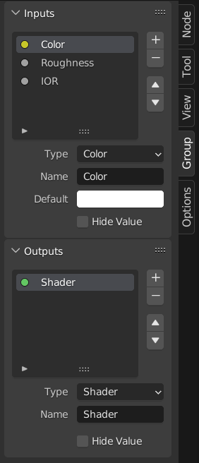
Group Sockets (Groepeer Sockets)
Reference (Referentie)
- Panel (Paneel):

Het Groepeer Sockets paneel.
This panel is used to add, remove, reorder, and edit the user interface elements of a node group. It defines how sockets appear on the group node and organizes them for clarity and usability.
Available item types include:
Inputs: Define input sockets for the node group.
Outputs: Define output sockets for the node group.
- Panels:
Group and organize related sockets together. Useful for structuring complex node setups. Panels always appear at the bottom of the node interface. They can be nested by dragging one panel on top of another in the interface item list.
- Panel Toggle:
Adds a boolean checkbox to a panel’s header, allowing control over its contents. This option is only available when a panel is selected in the interface item list.
Panel toggles have their own options under the Panel Toggle subpanel. Note that toggle sockets are not listed directly in the interface list—panels with toggles instead show a boolean socket icon next to their name. To make the toggle socket visible again, it must be unlinked from the panel.
Notitie
A panel toggle does not automatically disable or grey out its sockets. To visually and functionally disable sockets, use a Switch Node or similar logic and disconnect the socket manually.
- Interface Item List
A UI list view showing all input/output sockets and panels. Each item can be renamed and configured individually. The name appears in the node’s user interface.
Specials
- Duplicate Item
Duplicates the selected socket or panel.
- Make Panel Toggle
Converts the selected boolean input into a toggle for its parent panel. Only available when a panel is selected and the active item is a boolean socket.
- Unlink Panel Toggle
Removes the toggle relationship between a boolean socket and a panel, making it a regular stand-alone input again.
- Description (Omschrijving)
Het bericht dat wordt weergegeven wanneer je met de muis over de socket-eigenschappen zweeft.
- Default (Standaard)
De waarde die wordt gebruikt wanneer er niets is verbonden met de socket.
- Min, Max
De minimale en maximale waarde voor de UI-knop die in de node-interface wordt weergegeven. Let op: dit is niet de minimum- of maximumwaarde voor de data die door de node kan gaan. Als een socket een hogere waarde doorgeeft dan het maximum, wordt deze nog steeds onveranderd door de node verwerkt.
- Dimensions Vector Socket
Sets the number of components for the vector socket: 2, 3, or 4. Changing the dimension affects how the socket is drawn in the interface and how data is passed through the socket.
2D: Toont en gebruikt alleen X- en Y-componenten.
3D: Includes X, Y, and Z components.
4D: Includes X, Y, Z, and W components.
- Closed by Default Panels
Het panel is standaard gesloten bij nieuwe nodes.
Geometry Nodes
- Default Input
Invoer die wordt gebruikt wanneer de socket niet verbonden is. Vereist dat Waarde verbergen (Hide Value) is ingeschakeld.
- Hide Value
Verberg de socketwaarde, ook wanneer de socket niet verbonden is.
- Hide in Modifier
Toon de invoerwaarde niet in de interface van de geometry nodes-modifier. Hierdoor kan de invoer wel binnen een node group worden gebruikt, maar niet als invoer voor de modifier.
Deze optie is alleen beschikbaar voor geometry nodes en uitsluitend voor input sockets.
- Structure Type
What kind of higher order types are expected to flow through this socket.
- Auto (Automatisch):
Automatically detect a good structure type based on how the socket is used.
- Single (Enkele):
Sta alleen invoer van enkele waarden toe in plaats van Invoervelden.
Animation (Animatie)
Controls animation data for node group properties, including active Actions and their assigned Slot.
Zie Manually Assigning Actions and Slots voor meer informatie.
Make Group (Groep Aanmaken)
Reference (Referentie)
- Menu:
- Shortcut (Sneltoets):
Ctrl-G
Creates a new node group that contains all selected nodes.
Group Input and Group Output nodes will be created to represent connections to unselected nodes outside the group. Inputs will be routed to the Group Input and outputs routed to the Group Output.
When grouping a single node, the resulting node group will:
Preserve the interface of the original node, including panels and default values.
Inherit the name of the original node
When grouping multiple nodes, the group is created with inputs and outputs sockets generated from the connections. In this case, a generic name such as “NodeGroup”, “NodeGroup.001”, etc. is used.
Insert Into Group (Aan Groep Toevoegen)
Reference (Referentie)
- Menu:
Verplaatst de geselecteerde nodes naar de actieve group node. Om dit te gebruiken, selecteer je een set nodes, eindigend met de bestemmings-group node. Bij het uitvoeren van de bewerking worden deze nodes in die groep geplaatst. De verplaatste nodes worden verzameld in een eigen groep om hun verbindingscontext te behouden, met hun eigen group input- en group output-nodes. De bestaande input- en output-nodes van de groep worden bijgewerkt met nieuwe sockets, indien aanwezig, afkomstig van de nieuwe nodes. De node group moet worden bewerkt zodat deze één Group Input en één Group Output node bevat.
Edit Group (Groep Bewerken)
Reference (Referentie)
- Menu:
- Header (Hoofdbalk):
- Shortcut (Sneltoets):
Tab, Ctrl-Tab
Met een geselecteerde node group druk je op Tab om erin te gaan en de inhoud te bekijken. Druk nogmaals op Tab (of Ctrl-Tab) om de groep te verlaten en terug te keren naar de bovenliggende groep, dit kan de top-level node tree zijn of een andere node group. Je kunt de breadcrumb-navigatie linksboven in de node editor gebruiken om te zien waar je je bevindt in de hiërarchie.

Voorbeeld van een uitgeklapte node group.
Ungroup (Degroeperen)
Reference (Referentie)
- Menu:
- Shortcut (Sneltoets):
Ctrl-Alt-G
Verwijdert de group en plaatst de individuele nodes in je editor workspace (werkruimte). Geen interne verbindingen gaan verloren, en je kunt nu interne nodes verbinden met andere nodes in je werkruimte.
- Separate P
Scheid de geselecteerde nodes van de node group.
- Copy
Kopieer naar de bovenliggende node tree, terwijl de group intact blijft.
- Move (Verplaatsen)
Verplaats naar de bovenliggende node tree en verwijder uit de group.