Regions
Every Editor in Blender is divided into Regions. Regions can have smaller structuring elements like tabs and panels with buttons, controls and widgets placed within them.
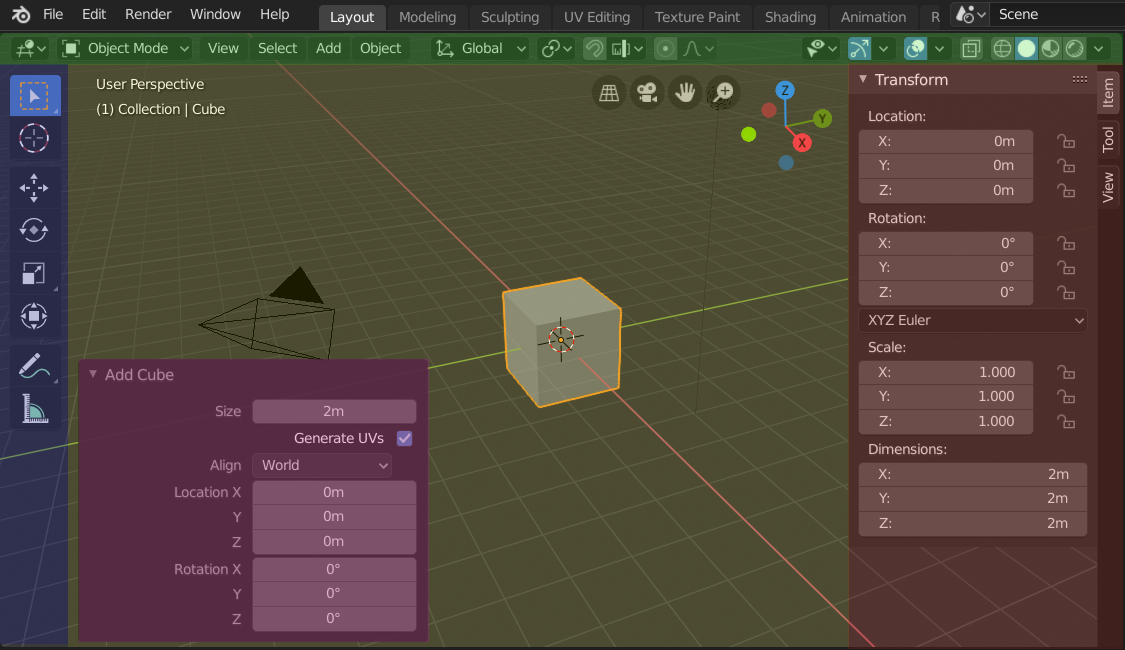
The regions of the 3D Viewport showing the Sidebar and the Adjust Last Operation panel after adding a Cube.
Header (green), Main region (yellow), Toolbar (blue), Sidebar (red) and Adjust Last Operation panel (pink).
Main Region
At least one region is always visible. It is called the Main region and is the most prominent part of the editor.
Each editor has a specific purpose, so the main region and the availability of additional regions are different between editors. See specific documentation about each editor in the Editors chapter.
Header
A header is a small horizontal strip, which sits either at the top or bottom of an area. All editors have a header acting as a container for menus and commonly used tools. Menus and buttons will change with the editor type and the selected object and mode.

The Header of the 3D Viewport.
Toolbar
The Toolbar (on the left side of the editor area) contains a set of interactive tools. T toggles the visibility of the Toolbar.
Tool Settings
A horizontal strip at the top or bottom of the editor (similar to the header) containing settings for the currently selected tool. Just like the header, it can be hidden and moved through its context menu.
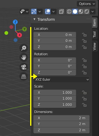
Adjust Last Operation
Adjust Last Operation is a region that allows tweaking an operator after running it. For example, if you just added a cube, you can use this region to tweak its size.
Arranging
Scrolling
A region can be scrolled vertically and/or horizontally by dragging it with the MMB. If the region has no zoom level, it can also be scrolled by using the Wheel while the mouse hovers over it.
Some regions, in particular animation timelines, have scrollbars with added control points to adjust the vertical or horizontal range of the region. These special scrollbars will have added widgets at the ends, as shown in the following image:

Scrollbars with zoom widgets.
This can be used to stretch or compress the range to show more or less detail within the available screen space. Simply drag one of the dots to either increase or decrease the displayed range. You can also quickly adjust both the horizontal and vertical range by dragging in the editor with Ctrl-MMB.
Changing the Size and Hiding Regions
Resizing regions works by dragging their border, the same way as Areas.
To hide a region, resize it down to nothing. A hidden region leaves a little arrow sign. LMB on this icon to make the region reappear.
|
|
Scaling
The scale of certain regions (such as the Toolbar) can be changed by dragging inside them with Ctrl-MMB, or using NumpadPlus and NumpadMinus while hovering the mouse cursor over them. Press Home to reset the scale to the default.
Asset Shelf
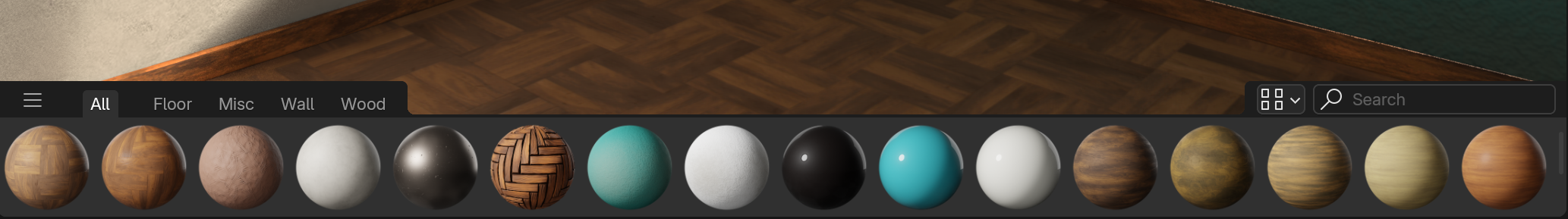
The Asset Shelf of the 3D View, showing material assets.
Search
To search for assets, hover your mouse over the Asset Shelf, then press Ctrl-F and type a search query. This will filter the poses to match what you typed.
Tabs
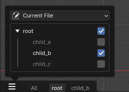
The usage of catalogs as tabs.
Catalogs can be shown as individual tabs. Each tab will only show its content, and the content of its children. That makes it easy to filter down to a certain set of assets.
Display Options
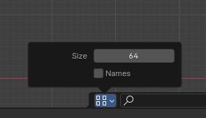
Display options available for the asset shelf.
It is possible to change the size of items on the shelf by using the size property.
By toggling on the “Names” checkbox, the asset names will be shown in the shelf. Alternatively it is also possible to hover over an item to show its name.
By default the shelf only has a height for one item row. To allow for more rows, drag it on the upper edge to increase its size.
Filter
- By Active Tool
Only show brushes applicable for the currently active tool in the asset shelf.
Note
The value of this property is stored in the Preferences, which may have to be saved manually if Auto-Save Preferences is disabled.