Regioni
Ogni editor in Blender è diviso in regioni. Le regioni possono avere elementi strutturali più piccoli come schede e pannelli con pulsanti, controlli e widget posizionati al loro interno.
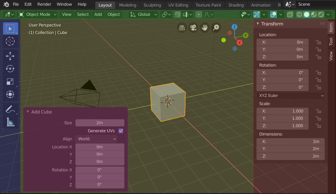
Le regioni del Viewport 3D mostrano la barra laterale e il pannello Regola Ultima Operazione dopo l’aggiunta di un cubo.
Intestazione (verde), Regione principale (giallo), Barra degli strumenti (blu), Barra laterale (rossa) e il pannello Regola Ultima Operazione (rosa).
Regione Principale
Almeno una regione è sempre visibile. Si chiama regione principale ed è la parte più importante dell’editor.
Ogni editor ha uno scopo specifico, quindi la regione principale e la disponibilità di regioni aggiuntive sono diverse tra gli editor. Vedi la documentazione specifica di ciascun editor nel capitolo Editor.
Intestazione
A header is a small horizontal strip, which sits either at the top or bottom of an area. All editors have a header acting as a container for menus and commonly used tools. Menus and buttons will change with the editor type and the selected object and mode.

L’intestazione del Viewport 3D.
Barra degli strumenti
The Toolbar (on the left side of the editor area) contains a set of interactive tools. T toggles the visibility of the Toolbar.
Strumento Impostazioni
A horizontal strip at the top or bottom of the editor (similar to the header) containing settings for the currently selected tool. Just like the header, it can be hidden and moved through its context menu.
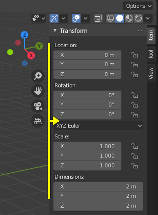
Regola Ultima Operazione
Adjust Last Operation is a region that allows tweaking an operator after running it. For example, if you just added a cube, you can use this region to tweak its size.
Disposizione
Scorrimento
A region can be scrolled vertically and/or horizontally by dragging it with the MMB. If the region has no zoom level, it can also be scrolled by using the Wheel while the mouse hovers over it.
Some regions, in particular animation timelines, have scrollbars with added control points to adjust the vertical or horizontal range of the region. These special scrollbars will have added widgets at the ends, as shown in the following image:

Scrollbars with zoom widgets.
This can be used to stretch or compress the range to show more or less detail within the available screen space. Simply drag one of the dots to either increase or decrease the displayed range. You can also quickly adjust both the horizontal and vertical range by dragging in the editor with Ctrl-MMB.
Changing the Size and Hiding Regions
Il ridimensionamento delle regioni funziona trascinandone il bordo, allo stesso modo di Areas.
To hide a region, resize it down to nothing. A hidden region leaves a little arrow sign. LMB on this icon to make the region reappear.
|
|
Scaling
The scale of certain regions (such as the Toolbar) can be changed by dragging inside them with Ctrl-MMB, or using NumpadPlus and NumpadMinus while hovering the mouse cursor over them. Press Home to reset the scale to the default.
Asset Shelf
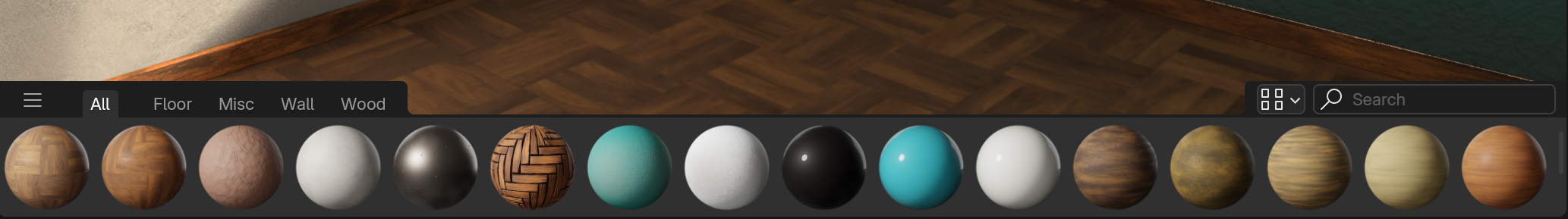
The Asset Shelf of the 3D View, showing material assets.
Cerca
To search for assets, hover your mouse over the Asset Shelf, then press Ctrl-F and type a search query. This will filter the poses to match what you typed.
Schede
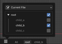
The usage of catalogs as tabs.
Catalogs can be shown as individual tabs. Each tab will only show its content, and the content of its children. That makes it easy to filter down to a certain set of assets.
Display Options
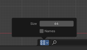
Display options available for the asset shelf.
It is possible to change the size of items on the shelf by using the size property.
By toggling on the «Names» checkbox, the asset names will be shown in the shelf. Alternatively it is also possible to hover over an item to show its name.
By default the shelf only has a height for one item row. To allow for more rows, drag it on the upper edge to increase its size.
Filtra
- By Active Tool
Only show brushes applicable for the currently active tool in the asset shelf.
Nota
The value of this property is stored in the Preferenze, which may have to be saved manually if Auto-Save Preferences is disabled.